
Our reference report featuring Schwartauer Werke
Digital Touch Kiosks for Flexible Use

The long-established brand Schwartauer Werke faced an exciting challenge: Several events were planned to celebrate a major company anniversary. The idea? To present various content and video formats to guests in a modern, digital way. An interactive touchscreen presentation with various sections was exactly the right approach. That’s where we at diliton came in: We were able to support the project with our software license and customized content, demonstrating just how versatile digital communication can be.
A versatile eye-catcher: From sales meetings to the reception area
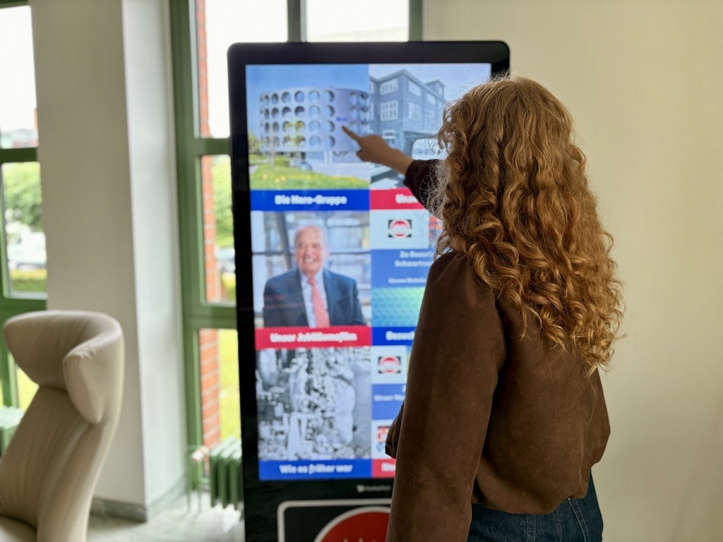
The great thing about this project is that the touchscreen kiosk isn’t just used for a single event. Schwartauer Werke uses the system flexibly for a wide variety of target audiences:
“We regularly use the display at events for external visitors and feature various types of content on it. It has already been used at large sales meetings to present new promotional videos. When neither of these events is scheduled, it is set up at our reception desk and displays information about our company in various categories.”
Complete flexibility: Customize content yourself in no time
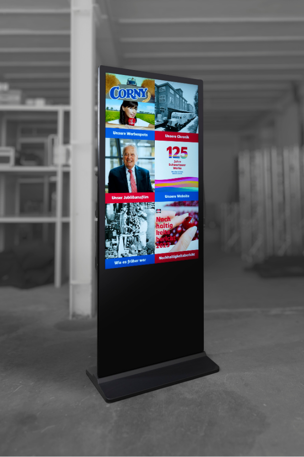
It was particularly important to us to provide the team with a tool that would allow them to operate completely independently in their day-to-day work. Thanks to our smart background programming, Schwartauer Werke can easily update the digital content themselves at any time. Whether it’s a last-minute sales meeting or the latest news for the reception area – the user interface makes it possible to quickly customize the presentation for any event, tailored to specific needs and with minimal effort.
Intuitive operation that requires no explanation
In a live setting, it quickly becomes clear just how well the concept is received. Because the interface resembles familiar devices, visitors have absolutely no reservations about using it:
“The fact that its design resembles a smartphone inspires many people to try out the kiosk right away, and the touch-based controls are very intuitive. This makes the kiosk even more appealing to us, since it doesn’t require any additional user manual.”
Customized content featuring the company’s branding
In addition to the technology, the visual design had to be just right, of course. For Schwartauer Werke, it was crucial that the content blend seamlessly into the existing brand identity. Together, we made that happen:
“The created content was tailored to our corporate identity, so the kiosk blends in very well with our other communication channels.”
We also really enjoyed working together on the project: “Communication with the diliton team was always reliable, friendly, and helpful.”
Comprehensive service, from consultation to support
From the initial idea through software implementation to ongoing support, we wanted to be a reliable partner on equal footing for Schwartauer Werke. We’re therefore thrilled with the feedback:
- Consulting & Concept Development: “Diliton was always reliably available to us at every stage and provided us with excellent advice in line with our expectations.”
- Software Setup: “Delivery, installation, and support went smoothly. The technology and operation of the device were explained to us clearly.”
- Follow-up support: “Afterward, the team was always available to answer questions.”
The Conclusion from Schwartauer Werke
Ultimately, the project demonstrates how to present a wealth of information in an interactive way within a minimal space:
“We highly recommend the kiosk as an eye-catcher and communication channel for events. It offers users the opportunity to interactively and independently view a wide variety of information and formats, all made available in a small space.”